Feedback Page Re-design
(Duration: 1 month)
The feedback page is a page heavily used by teachers to understand how their class is doing and who needs their work reviewed. This page hadn’t been updated to incorporate newer styles in our design system. I increased the scope of work to be able to better address the needs of teachers on this page while also improving the usability of the page.
Goals
Update page to reflect our new design styles
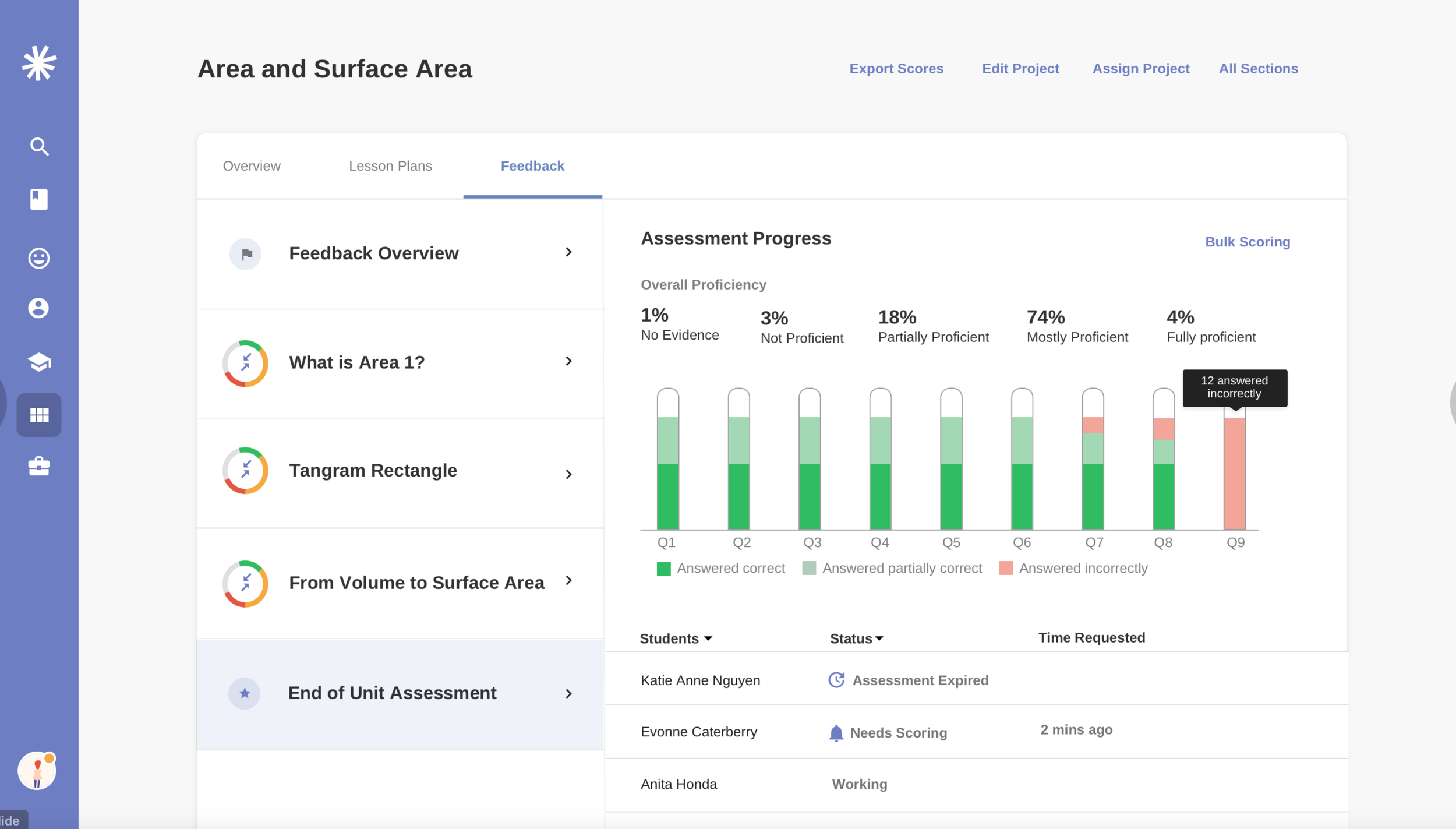
Support new math curriculum needs which now included online assessments
Improve data visualization to make it easier for teachers to see progress
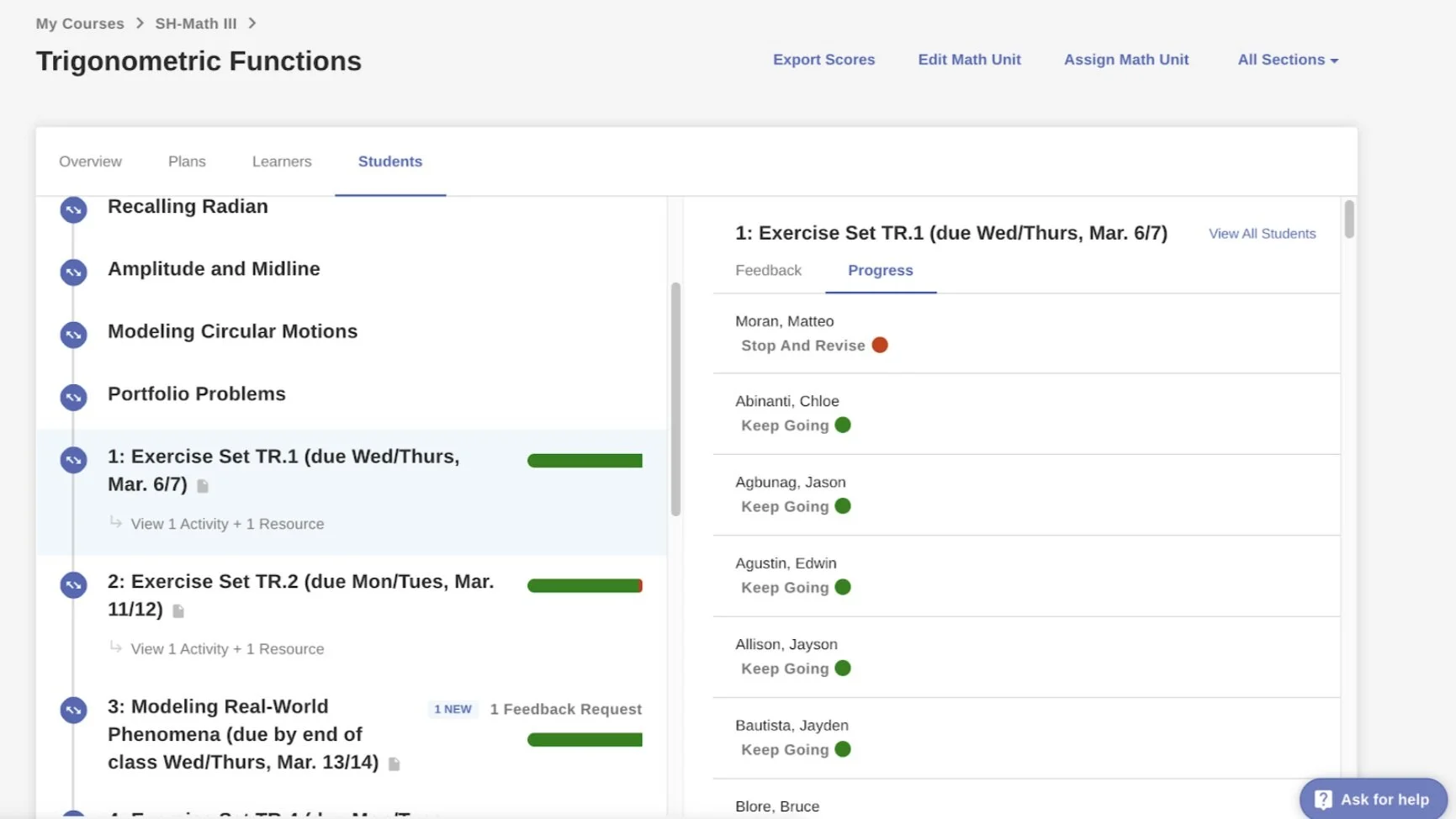
Existing Feedback Page
New Design system style for left-side tab navigation
Some of the Usability Issues Found
Double tabs required a lot of navigation to get to timely actions and understand student progress
Data visualizations were being cut off in left panel
Name of tab didn’t represent how teachers use this page
Concept Explorations for Visualizing Assessment Data
Part of this redesign was to support the new online Math assessments that would be rolled out. This required a summary visualization so that teachers were able to see how their class did on the assessment.
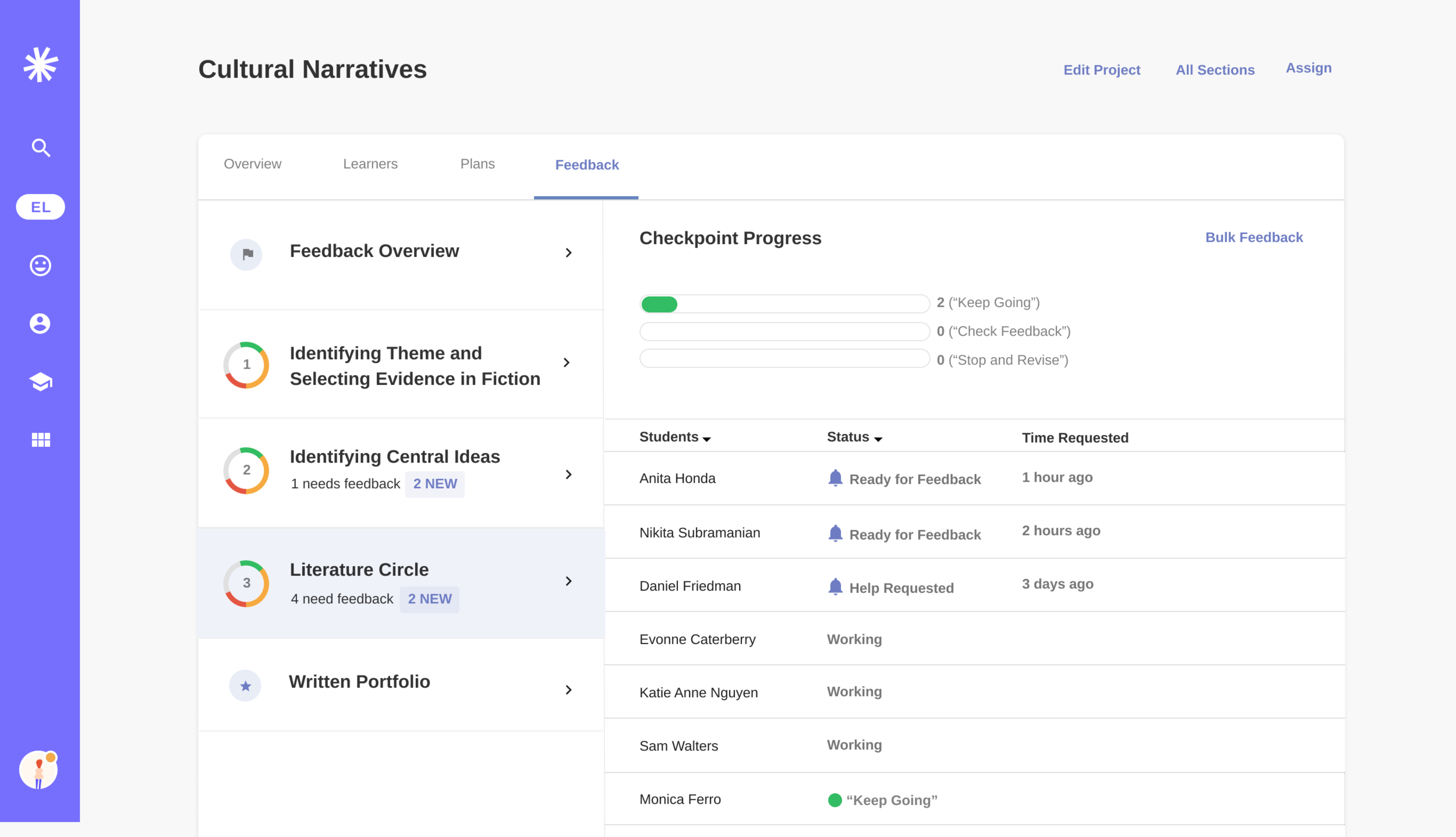
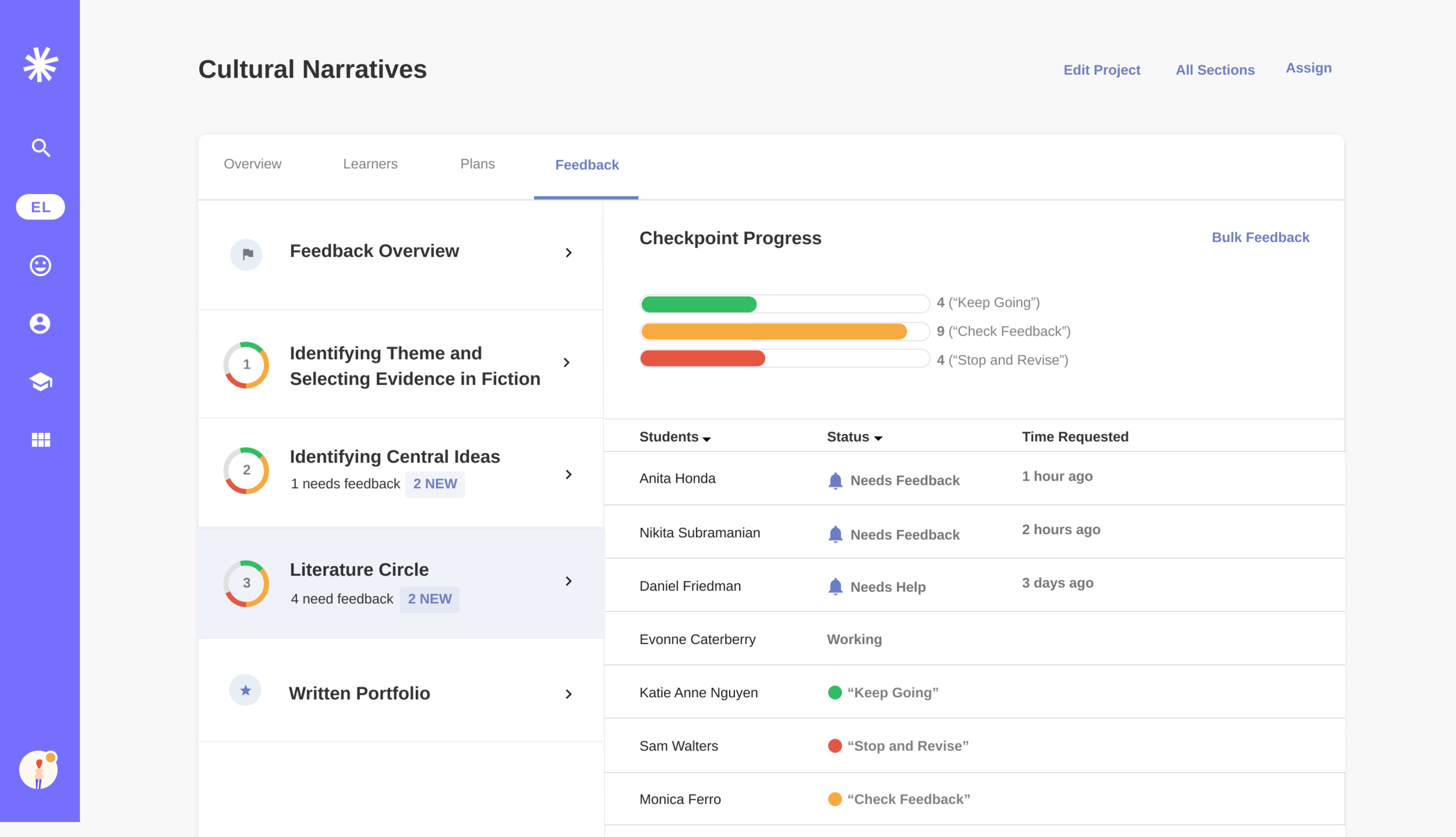
Prototype of Feedback Page States for Evaluative Research
Final Designs
Improvements Made
Renamed tab to Feedback to better communicate how teachers use page
Remove right panel sub-tabs and consolidate all student status types (needs feedback vs given feedback) into a dynamic list that was sorted with a default priority on students needing feedback or help.
Updated visualization style to include donut and bar chart to provide more scan-able top-level information
Changed link-style button on right side from being dynamic to persistent (prior this link changed name depending on what sub-tab was selected)


